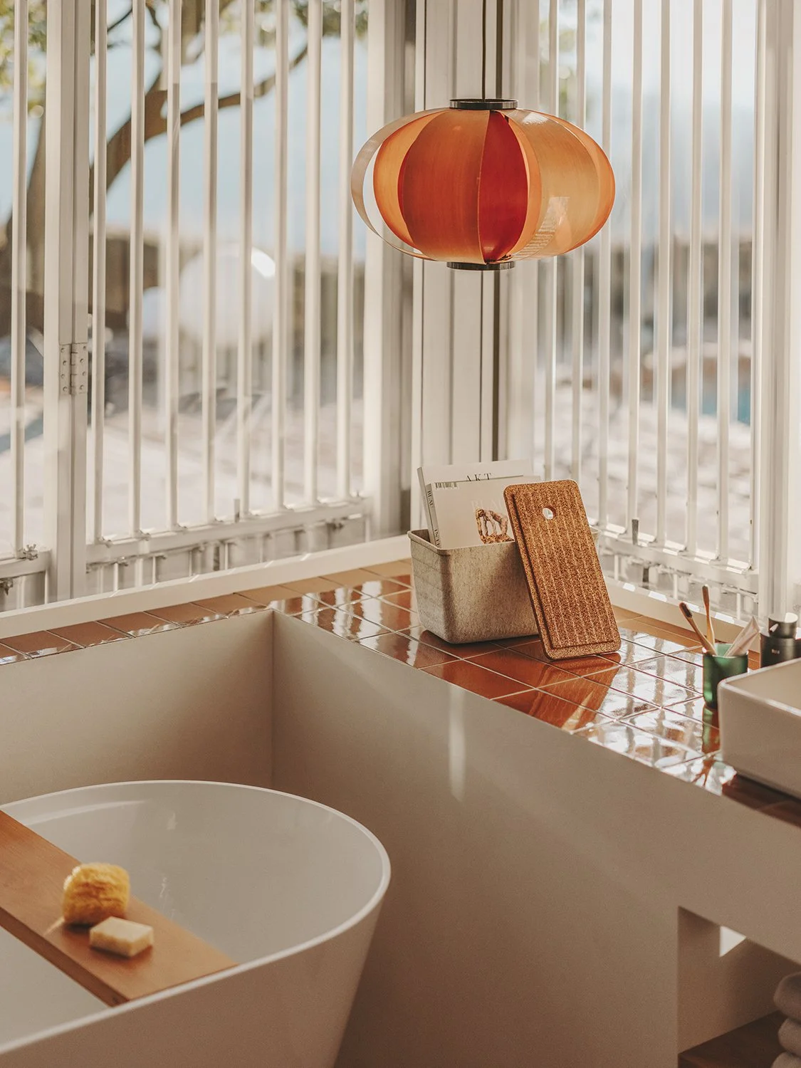
TURA BY ANDREU CARULLA
THE SUBTLE SILENCE OF GOOD DESIGN
THE SUBTLE SILENCE OF GOOD
-
-
Pictures by Salva López
Words by Inma Buendía -
For several months now, the concept of quiet luxury has been the subject of a plethora of articles in the press as one of this season’s trends. A lifestyle for which a company’s product is not as important as the quality that an article conveys. These items speak for themselves and express themselves. They mirror a work well made with the best raw materials; a new form of consumption that cuts across all styles and goes beyond a specific aesthetic.


The admiration for José Antonio Coderch, Josep Lluís Sert, Ricardo Bofill or Enric Miralles is a trait in common between Roca and Carulla, and the Tura collection, the combined realization of this fascination.“I love Coderch’s idea of citizen-centered architecture and design. It is like the work our studio does – more discreet, I’d even venture to say silent,” summarizes the designer. Thus, the setting chosen to introduce the collection is the house that Coderch designed and lived in with his family in Sant Feliu de Codines, Barcelona.
As Carulla himself states, “design is not a luxury when it helps people to live better.” The collection draws inspiration from elements as subtle as the shadows that the pergolas and shutters cast on spaces. A creation of volumes and geometric shapes that acquire interesting dimensions, stripping away the superfluous and letting emptiness reveal itself as an abstract and limitless resource.
The quiet luxury of a simple lifestyle which finds in the Mediterranean sea the ideal scenario to create functional, aesthetic and timeless solutions. It is no coincidence that the name of the Tura collection stems from the Spanish words for architecture and culture – arquitectura and cultura.
As a designer but also as an individual, Andreu Carulla seeks to distance himself from everything that does not convey certain values: “I’ve always wanted to work with Roca because they make amazing, high-quality products. Moreover, the use of ceramics and the geographical proximity made it a perfect match. Then I discovered that we speak the same language.”
Despite its elevated appearance, even the smallest decorative gesture of Tura aims to fulfill the desired functionality. This is one of the principles of Roca’s ethos and one which Carulla embraces at his design studio. The pieces should not only be useful but intuitive and easy. They must speak for themselves.
The Tura collection, which Roca will release in 2024, includes a series dedicated to toilets, six ideas for washbasin units, a free-standing bathtub and a range of storage ideas and accessories, such as headrests, designed for pampering. With both comfort and sustainability in mind, Roca’s products are made using the latest technologies and materials. This includes Roca’s Rimless system, which optimizes water flow and flushing efficiency, and the Supraglaze© surface treatment for maximum hygiene. One of the main innovations of the collection is the concealed drain of the washbasins. All of these sanitary wares come in white in gloss or matt finishes. The furniture is available in a range of colors (off-white, terracotta and grey) that harmonize with the durable materials used, resulting in modern natural finishes.
Founded in 1917, Roca has manufactured many of this country’s classics, combining tradition and knowledge with a passion for innovation and respect for the environment. Beliefs that this prestigious brand – dedicated to designing, manufacturing and retailing bathroom products for architectural projects – conveys via its 76 production plants and the 170 countries in which it operates.
Thanks to the work of renowned professionals such as Inma Bermúdez, David Chipperfield and Carulla himself, Roca is committed to contributing and enhancing the well-being of society and leaving a worthy legacy for future generations. The real luxury is to see how the firm nurtures its goal via the creation of designs as simple, bold and exciting as the Tura collection.
THE SPACE BETWEEN THE HANDS
CHILLIDA COLLECTION
Hands, such ancestral beauty they hold. With them we communicate, we create, we build, we feed, we give warmth, we touch, but they also hold us on to something; with them, we fight and struggle. It’s so peculiar the outstanding adaptability of the hands.
-
Openhouse magazine Nº21
-
CHILLIDA COLLECTION
Hands, such ancestral beauty they hold. With them we communicate, we create, we build, we feed, we give warmth, we touch, but they also hold us on to something; with them, we fight and struggle. It’s so peculiar the outstanding adaptability of the hands. They mirror our inherent situation almost before any other part of the body does. Pianist's hands, longshoreman's hands, cook's hands, caregiver's hands, artist's hands... each one of them paints a somewhat clear picture in the collective imagination.
Eduardo Chillida (San Sebastian, January 10th, 1924-August 19th, 2002) captured his own hands throughout his life. He never stopped doing it. Those same hands led him to forge an extensive body of work in steel and concrete, but also to pour his reflections into his writing and graphic work- from drawings to gravitations. It is precisely in this latter practice that nanimarquina found its inspiration for the new collection, which pays homage to the sculptor on the 100th anniversary of his birth. These gravitations were not simply overlapping sheets, but sculptural reliefs. The artist himself spoke of the discovery and development of this new form of sculptural relief made with paper: “I never liked using glue. Sticking paper together never struck me as the ideal solution. I suddenly thought: 'Instead of pasting these two pieces of paper together, why don’t I connect them some other way, sewing them with string or with another material?' I started to think about it, to experiment and the solution revealed itself. The place where the glue used to be was now occupied by space. How could you even compare glue with space? The gain is colossal”.

The dramatic tension in which the paper fragments are superimposed or alternated was nanimarquina's focus when transforming each chosen artwork into a carpet. “Playing with traditional techniques such as hand-knotted, soumak, or hand-tufted rugs; with the fibers- wool, and silk; and with the different heights; allowed the collection to capture that suspension that Chillida sought after in his gravitations.”
The result is four new pieces that complete the Chillida Collection, started a decade ago. Three rugs and a tapestry that, to be produced, required a retrospective of the Basque artist's pictorial works- from Gravitación (1997), Gravitación Tinta (1996), and Preguntas (1994) to the tapestry inspired by Gravitación Tinta (1991).
As fond of materials as Chillida, Nani Marquina has paid significant attention to the composition of her carpets and the manufacturing processes since the beginning of her brand in 1987.
“I never liked using glue. Sticking paper together never struck me as the ideal solution. I suddenly thought: ‘Instead of pasting these two pieces of paper together, why don’t I connect them some other way, sewing them with string or with another material?’ I started to think about it, to experiment and the solution revealed itself. The place where the glue used to be was now occupied by space. How could you even compare glue with space? The gain is colossal.”
Six years later, she embarked on her boldest business venture: moving production to northern India. This shift meant the inclusion of craftsmanship and tradition as the foundations of the company's designs: the hands, again, a feature of the production process that's so characteristic of the brand today.
On the 36th anniversary of the company, Nani Marquina keeps on leading the creative department in a very personal way: “My passion for art and my admiration for nature define the essence of my work, where art and design merge in an intuitive way,” explains the creator, who continues: “For this reason, I wanted to pay tribute to Chillida, an artist of my time and from my country whose way of understanding space influenced me immensely.
EL ESPACIO ENTRE LAS MANOS
CHILLIDA COLLECTION
Las manos, qué belleza atávica encierran. Con ellas nos comunicamos, creamos, construimos, nos alimentamos, damos calor, acariciamos pero también nos aferran a algo; con ellas peleamos y luchamos. Es curiosa la excelsa mutabilidad de las manos.
-
Openhouse magazine Nº21
-
CHILLIDA COLLECTION
Las manos, qué belleza atávica encierran. Con ellas nos comunicamos, creamos, construimos, nos alimentamos, damos calor, acariciamos pero también nos aferran a algo; con ellas peleamos y luchamos. Es curiosa la excelsa mutabilidad de las manos. Reflejan nuestra situación vital casi antes que cualquier otra parte del cuerpo. Manos de pianista, manos de estibador, manos de cocinero, manos de cuidadora, manos de artista... cada una de ellas dibuja una imagen más o menos clara en el imaginario social.
Eduardo Chillida (1924-2002) plasmó las suyas durante toda su vida. Nunca dejó de hacerlo. Esas mismas manos le llevaron a forjar una extensa obra de acero y hormigón pero también a verter sus reflexiones en escritos y obra gráfica, desde dibujos a gravitaciones. Es precisamente en esta última práctica donde nanimarquina se ha imbuido para la nueva colección que homenajea al escultor cuando se cumplen 100 años de su nacimiento. Las gravitaciones no eran simples hojas superpuestas sino relieves escultóricos.
El propio artista habló del hallazgo y desarrollo de esta nueva forma de relieve escultórico hecho con papel: “A mí nunca me había gustado la cola. El hecho de pegar los papeles no me parecía lo ideal. De repente pensé: ‘¿Por qué en vez de pegar estos dos papeles, no los unes de alguna manera con cuerda o con lo que sea?’ Empecé a darle vueltas, a hacer pruebas y apareció la solución. En el lugar donde antes estaba la cola, metía el espacio. ¡Cómo vas a comparar el espacio con la cola! La ganancia es tremenda”.
“A mí nunca me había gustado la cola. El hecho de pegar los papeles no me parecía lo ideal. De repente pensé: ‘¿Por qué en vez de pegar estos dos papeles, no los unes de alguna manera con cuerda o con lo que sea?’ Empecé a darle vueltas, a hacer pruebas y apareció la solución. En el lugar donde antes estaba la cola, metía el espacio. ¡Cómo vas a comparar el espacio con la cola! La ganancia es tremenda”
La tensión dramática en la forma de superponer o intercalar los fragmentos de papel, ha sido la obsesión de nanimarquina al transformar en alfombra cada una de las obras elegidas. “Jugar con las técnicas artesanales como handknotted, sumak o handtufted; con las fibras, lana y seda; y con las distintas alturas, ha permitido reflejar en la colección esa suspensión que Chillida buscaba en sus gravitaciones”.
El resultado son cuatro piezas nuevas que completan la Colección Chillida iniciada hace una década. Tres alfombras y un tapiz para cuya creación se realizó una retrospectiva de las obras pictóricas del artista vasco, desde la Gravitación de 1997, Gravitación Tinta de 1996, Preguntas de 1994 hasta el tapiz basado en Gravitación Tinta 1991.
Tan amante de la materia como Chillida, Nani Marquina prestó especial atención a la composición de sus alfombras y a los procesos de manufacturación desde el inicio de su marca en 1987. Seis años después, emprendió su aventura empresarial más audaz trasladando la producción al norte de India. Un movimiento que supuso la incorporación de la artesanía y la tradición como fundamentos de su diseño: las manos, de nuevo, como rasgo del modo de producción tan característico de la firma a día de hoy.
En el 36º aniversario de la firma, Nani Marquina sigue dirigiendo el área creativa de manera muy personal: “La pasión por el arte y la admiración que me causa la naturaleza definen la esencia de mi trabajo, donde el arte y el diseño se mezclan de una manera intuitiva”, explica la creadora, que continúa: “Por este motivo he querido homenajear a Chillida, un artista de mi tiempo y de mi país cuya manera de entender el espacio me influenció enormemente.”

SHON MOTT
FOLIE À DEUX
-
Publireportaje para Shon Mott.
-
Openhouse magazine
Issue Nº16 -
Fotos de Arale Reartes
https://www.aralereartes.com/
Shon Mott
https://shonmott.com -
Shon Mott Openhouse
FOLIE À DEUX
Desde la prehistoria, el ser humano se ha establecido en espacios íntimos, en cabañas, chozas o grutas en los que disfrutar de cierta privacidad. Este hogar, en ocasiones no es físico sino que puede estar representado por una persona o por un paisaje. Incluso cuando no tenemos nada a lo que aferrarnos, el cuerpo se convierte en nuestro asilo. Eso lo sabe bien Arale Reartes, quien durante la pandemia, exploró el autorretrato y, al tiempo que buscaba su lugar hacia fuera, inició ese mismo viaje hacia dentro. En el camino, esta fotógrafa de Barcelona ha recorrido medio mundo: Italia, París, Londres, Japón, Estados Unidos... Su última parada ha sido Islandia, donde ha creado el proyecto ‘Folie à deux’, un viaje sensorial con muy poco equipaje: sus cámaras de fotos y las prendas de SHON MOTT.


Para esta firma de moda barcelonesa, su hogar es el Mediterráneo. El invierno frente al mar en plena Costa Brava, la gama de azules verdosos que nace del diálogo de color entre el agua y el cielo, su humedad en forma de bruma o la tramontana, forman parte del viaje creativo que Shon Mott realizó para diseñar las prendas de la nueva temporada de invierno 2021-2022. «SHON MOTT está muy arraigado al Mediterráneo, por eso quería fotografiar un lugar que, compartiendo los mismos valores de éste, como la calma, la naturaleza o la majestuosidad, aportara algo diferente, y creo que ese lugar es Islandia», explica Arale.
«Nos inspira nuestro paisaje, su ritmo, su clima y su belleza», explica Kiko Buxó, responsable de comunicación de esta empresa familiar. Él es quien nos recibe en la sede que la firma de moda tiene en Barcelona. La oficina no se atiene a los estereotipos de un espacio de trabajo, aséptico y quizá algo frío del siglo XXI, sino a los de una residencia familiar del siglo pasado con suelos de madera y techos con delicadas molduras de reminiscencias francesas. Kiko me explica emocionado que, precisamente París es la siguiente ciudad en la que SHON MOTT contará con un punto de venta propio.
Para esta familia cuya vinculación con la moda viene de lejos, SHON MOTT es el más extraordinario de los lugares a los que volver. Un hogar en el que los tres hermanos, Kiko, Pep y Lluís, se encuentran, trabajan y desarrollan su creatividad.
La atemporalidad en el diseño y la durabilidad de los materiales característicos de esta firma —el cashmere de Loro Piana, la seda natural y el algodón orgánico— no parecen ser sinónimo de los preceptos de la moda de hoy. Una perspectiva que tiene mucho que ver con la formación en diseño industrial de Pep, quien se encarga de crear y desarrollar las colecciones. Desde el nacimiento de la marca en 2015, éstas se han contagiado de recuerdos familiares que, interpretados en clave contemporánea —bajo los preceptos de funcionalidad y sostenibilidad— han ido configurando una suerte de álbum de fotos en forma de ropa. «Nos inspira mucho nuestro día a día pero también las referencias de nuestra infancia y adolescencia. Nuestra familia siempre se ha dedicado a la moda y tenemos muchísimos recuerdos de viajes a París, a Nueva York y a Milán. Lugares a los que se acudía para ver moda en los años 90», resume Kiko.
Para la creación de las campañas, de las que es responsable el propio Kiko, su apuesta siempre es audaz: «Nos gusta pensar que nuestro cliente tiene un nivel intelectual y aprecia la existencia de un mensaje que vaya más allá de las prendas. Queremos generar contenido a la altura de nuestros clientes gracias a mentes creativas como Arale Reartes, con gran talento y mucho que contar».
Ahora el particular álbum de viaje de SHON MOTT recala en Islandia. Un lugar lleno de magia que seguro llenará la memoria familiar de nuevos recuerdos.

LAPALA by MANEL MOLINA
WITH THE WIND IN YOUR SAILS
WITH THE WIND
IN YOUR SAILS
-
Advertorial about Lapala by Manel Molina for Expormim.
-
-
“The sea can be choppy or calm, it can carry you safely home or sweep you straight into the eye of a hurricane.”
The sea can be choppy or calm, it can carry you safely home or sweep you straight into the eye of a hurricane. When the wind is in your sails, everything seems possible and, with the helm in your hands, you believe that you steer your destiny.
Lapala was one of the first chairs to be designed by Manel Molina. The main challenge in its creation was to combine ergonomics with a chair made of wickerwork. Back then, this raw material was only used in combinations of straight wickerwork panels, with little room for further potential. However, design is all about finding solutions, and Manel Molina was so successful in overcoming this problem that Lapala’s ergonomic design served as a reference point for several subsequent models by Lievore Altherr Molina, the studio founded by Manel and his colleagues, Alberto Lievore and Jeannette Altherr, in 1991.
In real life, your destiny is not always yours to steer. A raging sea can sweep away everything in its path, casting you adrift. Lapala ran aground in just such a way. It might have remained beached there and gradually fallen into oblivion, but Lievore Altherr Molina was loath to let this happen. The design studio saw its salvation in Expormim. Such was the expertise and creative potential of this company, originally known as La Exportadora de Mimbre, that it was the only one capable of breathing new life into the collection and improving on all its features and different models: its barstool, dining chair, low armchair and footstool.
Expormim’s team played a key role in sourcing just the right material for its curved structure: nautical rope able to lend its delicate discrete elegant design an added sense of resistance, while also reinforcing its robust painted stainless steel structure. The end result is a lightweight design of eye-catching Mediterranean beauty, uniting simplicity and functionality with sobriety and versatility.
LAPALA by MANEL MOLINA
CON EL VIENTO A FAVOR
CON EL VIENTO
A FAVOR
-
Publireportaje sobre la silla Lapala diseñada por Manel Molina para Expormim.
-
-
“El mar puede ser bravo, calmado, llevarnos a buen puerto o dirigirnos al centro del huracán. Con el viento a favor, todo parece ser posible y con las manos en el timón, creemos ser nosotros quieres indicamos el rumbo”
El mar puede ser bravo, calmado, llevarnos a buen puerto o dirigirnos al centro del huracán. Con el viento a favor, todo parece ser posible y con las manos en el timón, creemos ser nosotros quieres indicamos el rumbo.
Lapala fue de las primeras sillas que Manel Molina diseñó en su carrera. El gran reto de su composición era mantener la ergonomía necesaria en una silla con el mimbre como materia prima. La utilización de este material se limitaba por entonces a la combinación de paneles rectos de escasa adaptabilidad. Pero el diseño es solucionar problemas. Éste fue resuelto con tanto éxito que su ergonomía sería el referente de diversos modelos desarrollados posteriormente por Lievore Altherr Molina, el estudio fundado por Manel junto a sus colegas Alberto Lievore y Jeannette Altherr en 1991.
La realidad es que el rumbo no siempre depende de nosotros. La mala mar puede arrasarlo todo y hacer que vayamos a la deriva. El temporal había encallado la vida de Lapala. Ésta podría haber quedado en el fondo del mar y caer en el olvido pero Lievore Altherr Molina se resistía a ello. El estudio de diseño vio en Expormim la impronta necesaria para ponerla a salvo.
El gran oficio y capacidad creativa de la antigua Exportadora de Mimbre, les situaba como la única empresa capaz de reinventar la colección y mejorarla en todos los aspectos y en todas sus variantes: sillón comedor, silla, sillón y taburete. Su equipo fue clave a la hora de dar con el material idóneo para una estructura eminentemente curva: la cuerda náutica. Una aliada que infiere una pátina de resistencia a su delicada y discreta elegancia, al tiempo que refuerza una estructura de gran fortaleza compuesta por acero inoxidable pintado. El resultado es un diseño de gran belleza mediterránea articulada sobre un leguaje sencillo y funcional que aúna sobriedad, ligereza y versatilidad.
Jaime Hayon
A REBELLIOUS SPIRIT
Jaime has never felt identified with any particular label. Philippe Starck’s daring, courage and strength were a huge source of inspiration when he started out at design school: “that rebellious spirit that dares to break the rules”.
-
Interview to Jaime Hayon in regards of his collaboration with Expormim.
-
-
Photos by Mari Luz Vidal
mariluzvidal.comExoprmim
expormim.com -
A REBELLIOUS SPIRIT
Chic, inviting, lightweight and dynamic... Defining the Frames collection by Expormim is tantamount to describing the personality of its designer, Jaime Hayon. This professional dreamer—who designs, draws and, above all, creates—transforms the seemingly impossible into a reality.
His indomitable imagination is fuelled by the incessant new challenges that he sets himself, paying no heed to dogmas or limitations. Drawing is as vital to him as the oxygen he breathes and so he can be found doing it at any time of day: at breakfast time with the kids, while out shopping at his favourite market, Mercado Central in Valencia, where he lives, or over a beer or two with friends.
Jaime has never felt identified with any particular label. Philippe Starck’s daring, courage and strength were a huge source of inspiration when he started out at design school: “that rebellious spirit that dares to break the rules”. As a designer, Hayon’s ideas have an intrinsic strong artistic facet. “Art interests me as a powerful highly expressive platform for creative freedom.”
“Art interests me as a powerful highly expressive platform for creative freedom.”
Thanks to Hayon’s distinctive way of combining disciplines, at Fábrica–the prestigious testing ground for creative experimentation in Treviso, Italy, where he went after completing his studies at the Instituto Europeo di Design–he developed a style all of his own. For this tireless globetrotter, travel is an opportunity to discover new ways of doing things and new challenges. “Travel is invigorating. It’s an opportunity to learn. Everywhere I go, I find new sources of inspiration.”
Colour, shape and composition are the starting points for each and every one of his creations. His over two hundred sketchbooks bear witness to all his ideas. They reflect the inner world of this Madrid designer with a Mediterranean soul, from the most oneiric to the most technical of images, in addition to his ideas for future projects.
Expormim’s honesty and dedication were all important factors in his collaborative relationship with the company. “I love the effort they make to revive traditional crafts. I think they do it with extreme elegance and savoir-faire.”
Jaime decided to work with rattan in unconventional fashion, “highlighting its superiority as a material and the art that goes into working with it”. Understandably, one of the stages in the creative process that he most enjoys is working alongside craftsmen: “They bring a high degree of skill and humanity to the process. There are few crafts- men or women still active today in Spain and the sector needs supporting.”
The Frames collection–made up of panels that play a combined structural and ergonomic role–was a hit success from the moment that it was launched in 2014. Two years later, it would receive the 2016 German Design Award and, this year, it has been singled out to receive the 2019 If Design Award.
A collection that is all set to become a contemporary classic, Frames encapsulates the past, present and future of Expormim. Through the collection’s rustic charm and sober distinction, combined with simple yet sophisticated aesthetics, this Valencia firm with a business history of over 60 years has taken yet another step forward in acknowledging not just a craft but a material–rattan, that combination of tradition and contemporary appeal.
Jaime Hayon
ESPÍRITU REBELDE
Jaime nunca se ha sentido identificado con ninguna etiqueta en particular. La audacia, el coraje y la fuerza de Philippe Starck fueron una gran fuente de inspiración cuando comenzó en la escuela de diseño: “ese espíritu rebelde que se atreve a romper las reglas”.
-
Entrevista a Jaime Hayon en relación a su colaboración con Expormim.
Publicado en inglés.
-
-
Fotos de Mari Luz Vidal
mariluzvidal.comExoprmim
expormim.com -
ESPÍRITU REBELDE
Elegante, cálida, ligera y vitalista, definir la colección Frames de Expormim, es como describir la personalidad de su diseñador, Jaime Hayon. Este soñador de profesión —que diseña, dibuja y, sobre todo, crea— convierte en posible aquello que parece inalcanzable. De naturaleza indómita, su imaginario se construye a partir de la incesante creación de nuevos retos sin reparar en límites o dogmas. El dibujo es su oxígeno y, como tal, lo practica a todas horas: desayunando junto a sus hijos, haciendo la compra en su adorado Mercado Central de Valencia –donde reside- o de cañas con los amigos.
Jaime nunca se ha sentido identificado con ninguna etiqueta en particular. La audacia, el coraje y la fuerza de Philippe Starck fueron una gran fuente de inspiración cuando comenzó en la escuela de diseño:“ese espíritu rebelde que se atreve a romper las reglas”. Como diseñador, las ideas de Hayon tienen una fuerte faceta artística intrínseca. “El arte me interesa como una poderosa plataforma altamente expresiva para la libertad creativa”. Gracias a la forma distintiva de Hayon de combinar disciplinas, en Fábrica –el prestigioso campo de pruebas para la experimentación creativa en Treviso, Italia, donde fue después de completar sus estudios en el Instituto Europeo di Design– desarrolló un estilo propio. Para este incansable trotamundos, viajar es una oportunidad para descubrir nuevas formas de hacer las cosas y nuevos desafíos. “Viajar es estimulante. Es una oportunidad para aprender. Dondequiera que voy encuentro nuevas fuentes de inspiración”. El color, la forma y la composición son los puntos de partida de todas y cada una de sus creaciones. Sus más de doscientos cuadernos de dibujo dan testimonio de todas sus ideas. Reflejan el mundo interior de este diseñador madrileño de alma mediterránea, desde las imágenes más oníricas a las más técnicas, además de sus ideas para futuros proyectos.
“El arte me interesa como una poderosa plataforma altamente expresiva para la libertad creativa”
La honestidad y dedicación de Expormim, unida a su esfuerzo por recuperar el oficio, fueron claves para Jaime, quien se propuso trabajar el rattan de una manera que no fuera la habitual. Compuesta por paneles que forman al mismo tiempo cuerpo y ergonomía, la colección Frames fue un éxito desde su lanzamiento en 2014. Dos años después recibiría el German Design Award 2016 y este mismo año ha sido reconocida con el If Design Award 2019.
Camino de convertirse en un clásico contemporáneo, la colección Frames es de aquellas obras que define el pasado, el presente y el futuro de Expormim. Una mezcla de rusticidad y sobria distinción que, unida a su estética simple pero sofisticada, ha llevado a la casa valenciana con más de 60 años de trayectoria, a dar un nuevo paso en su camino hacia el reconocimiento no sólo de una labor sino de un material, el rattan, tan tradicional como actual.
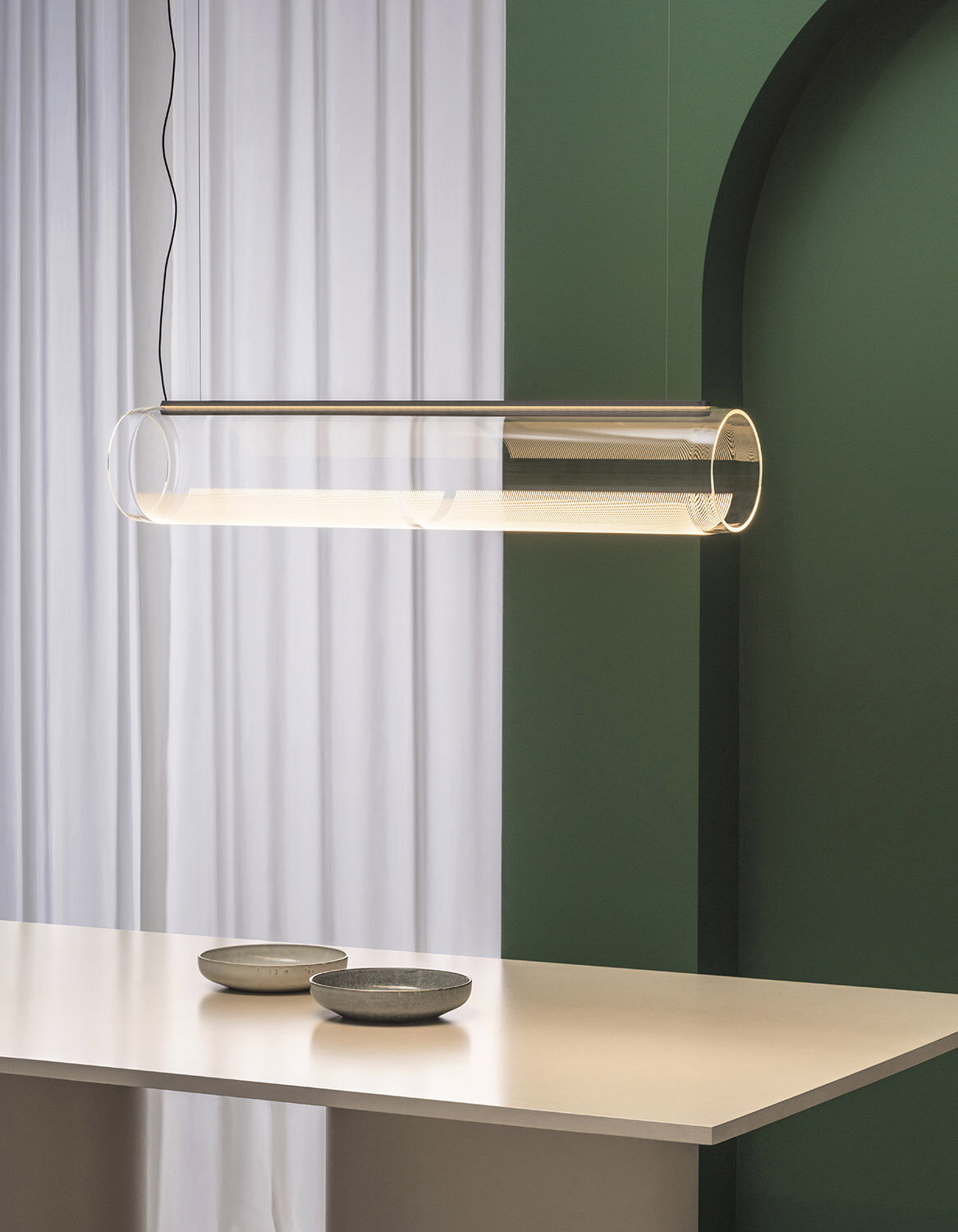
GUISE by STEFAN DÍEZ
TOTAL INTERNAL REFLECTION
TOTAL INTERNAL
REFLECTION
When I was little, I was scared of the dark. Dusky shadows awoke feelings of unease. I remember waking up in my room while my parents were in the lounge, watching TV or having a drink. It is odd how switching on the little bedside lamp made me feel snug and protected, as if in a safe haven.
-
Advertorial story about Guise lamp by Stefan DíeZ for Vibia.
-
-
Light is a beam that we can only embrace, accompany and magnify. The design of the form used to radiate it determines the strength and projection of its rays. For Stefan Díez, the starting point for the creation of the Guise lighting collection was to explore the link between luminosity and transparency. In his work, he tends to seek integral design systems, in this case aspiring to achieve total internal reflection.
“The mystery of light, its origin, form and perception have all been studied and analysed in the field of philosophy for centuries. Depending on the form it takes, this then determines our thinking and our world. ”
Based on the idea that light is invisible until it reaches an edge, he chose glass as the material to moderate this relationship. It is no easy task to try and shape light through transparency, but Vibia and the designer both enjoy setting themselves a challenge as a way of coming up with innovative solutions. The initial item that was designed for the collection is a disc-shaped luminaire fixed to a wall that acts as a reflector, transforming the disc into a celestial body that floats in space, radiating a perimeter halo of light. In the case of the tubular luminaire, the beam of light travels through the cylinder, only becoming visible when it reaches the pattern engraved in the glass, the reflective material in this sinuous version.
The mystery of light, its origin, form and perception have all been studied and analysed in the field of philosophy for centuries. Depending on the form it takes, this then determines our thinking and our world. Vibia designs products and generates languages that are conceived to interpret light. If Platon’s allegory of the cave teaches us that shadows distort our perceptions and suffocate our capacity to think, it is only through clarity that the world and its complexity can be understood. I am no longer scared of the dark, but light continues to be my refuge. Vibia sums it up like this: life is all the more beautiful when light forms part of it.
GUISE by STEFAN DÍEZ
REFLEXIÓN INTERNA TOTAL
REFLEXIÓN INTERNA
TOTAL
Cuando era pequeña tenía miedo a la oscuridad. Las sombras generadas por la escasez de luz me inquietaban. Recuerdo despertarme en mi habitación mientras mis padres estaban en el salón, viendo la televisión o tomando una copa. Es curioso cómo encendiendo la pequeña lámpara a mi lado, me sentía protegida y en un lugar seguro en el que refugiarme.
-
Publireportaje sobre la lámpara Guise diseñada por Stefan DíeZ para Vibia.
-
-
La luz es un haz que únicamente podemos abrazar, acompañar y aupar. Por eso, el diseño de aquella forma que la dibuja, decide su proyección y potencia. Para Stefan Díez, la idea de explorar la relación entre luminosidad y transparencia fue el punto de partida para crear la colección de lámparas Guise. Su fórmula de trabajo surge habitualmente de la búsqueda de un método integral. En este caso, el creador ambicionaba la reflexión interna total.
“El misterio de la luz, de su origen, forma y percepción ha sido estudiado y analizado por la filosofía desde hace siglos. Según sea ésta, así será nuestro mundo y así se ordenará nuestro pensamiento.”
Partiendo del principio de que la luz permanece invisible hasta que llega a un borde, dio con el vidrio como el material adecuado para moderar dicha relación. Tratar de darle forma mediante el uso de la transparencia es un reto difícil de asumir, pero tanto a Vibia como al diseñador, les gusta la idea de establecer una meta sobre la que construir soluciones innovadoras. El disco fue el punto de partida de la colección. En ella, la pared sostiene la luminaria y actúa como reflector, lo que permite percibir la lámpara como un cuerpo radiante que flota en el espacio desprendiendo un halo perimetral. En su versión tubular, el haz viaja a través del cilindro y se hace visible cuando alcanza los patrones grabados en el vidrio, el material reflector de esta sinuosa versión.
El misterio de la luz, de su origen, forma y percepción ha sido estudiado y analizado por la filosofía desde hace siglos. Según sea ésta, así será nuestro mundo y así se ordenará nuestro pensamiento. Vibia diseña piezas y genera lenguajes para su interpretación. Si el mito de la caverna de Platón nos enseñó que las sombras deforman nuestra percepción y ahogan nuestro pensamiento, es sólo a través de la claridad cuando el mundo puede entenderse en su complejidad. Yo ya no tengo miedo a la oscuridad, pero la luz sigue siendo mi refugio. Vibia lo resume así: la vida es más bella cuando la luz forma parte de ella.